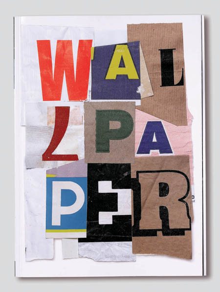
AWAY
SKETCHING
:)
alongside the sketches
Okay
Paul was happy with what I was doing from the mini sketches so he gave me a few ideas of what I could do to expand what I'm doing onto a wider scale but would I have the time?
He suggested I look more at Josef Muller-Brockmann
'type and picture area with 32 grid fields' as it would help with understanding why modernists influenced using a grid structure when designing.
Another suggestion was to take 5 quotes that best describes the fundamentals of graphic design.
and in some way interpret that in or as a final outcome/s.
I think it would help with what I want to achieve from this project. (will explain more in an evaluation after the project is finished).
Thoughts...
Feeling a little annoyed that i am running out of time and i still cant finalised my ideas i have done so much reading and researching i don't see why i am finding it so hard to draw any sketches or drum up the meatiest part of this project.
It seems i need to get stuck in more into the tools used and techniques more than how it looks.
pencil and paer just like in the 20th century how designers and typographers started there ideas generation process.
It seems i need to get stuck in more into the tools used and techniques more than how it looks.
pencil and paer just like in the 20th century how designers and typographers started there ideas generation process.
Thoughts.... why chose that quote
I feel that the quote says it all really eeeerrrrmmmm...
if you break it down:
1st line: order to information - what is being asked of you to design or create as the designers
2nd line: form to ideas - turning the information into ideas
3rd line: expression and feelings to artefacts - the feeling towards the design during and after the design process, is reflected in the human experiences.
And designs whether it is a poster, book, photograph, website, leaflet etc.
http://www.1designsource.com/quotes.html
The quote I have chosen is...
In graphic design, "the essence is to give order to information, form to ideas, expression and feeling to artifacts that document human experience."
Philip B. Meggs
A history of graphic design
1983
Philip B. Meggs
A history of graphic design
1983
Quotes
So in my note book I listed a number of quotes that I found interesting and positive to the way I think and work about art and design.
"Design can be art. Design can be aesthetics. Design is so simple, that's why it is so complicated."
Paul Rand, 1997
"Think 8 hours, work 2 hours" Mikro llic
"Art and technology - a new unity" Bauhaus
“For after all, a poster does more than simply supply information on the goods it advertises; it also reveals a society’s state of mind.”
- Armin Hofmann
"A design should have some tension and some expression in itself. I like to compare it with the lines on a football field. It is a strict grid.
In this grid you play a game and these can be nice games or very boring games."
Wim Crouwel
"Typographical design should perform optically what the speaker creates through voice and gesture of his thoughts."
El Lizzitsky
"Design can be art. Design can be aesthetics. Design is so simple, that's why it is so complicated."
Paul Rand, 1997
"Think 8 hours, work 2 hours" Mikro llic
"Art and technology - a new unity" Bauhaus
“For after all, a poster does more than simply supply information on the goods it advertises; it also reveals a society’s state of mind.”
- Armin Hofmann
"A design should have some tension and some expression in itself. I like to compare it with the lines on a football field. It is a strict grid.
In this grid you play a game and these can be nice games or very boring games."
Wim Crouwel
"Good artists copy, great artists steal" Pablo Picasso
"Typographical design should perform optically what the speaker creates through voice and gesture of his thoughts."
El Lizzitsky
"The grid system is an aid, not a guarantee. It permits a number of possible uses and each designer can look for a solution appropiate to his personal style. But one must learn how to use the grid; it is an
art that requires practice." Josef Muller-BrockmannMeeting up with Paul and peers
Today we had a group crit not everyone was in so it was more of a one to one tutorial.
I won't add everything that was discussed but the key points:
- need to define the point of this project
- maybe find a quote of some kind and adapted in into your work (that could be your won manifesto)
- list what you would or want to achieve from this project as i think i have lost the aim of the project
- start sketching time is of the essence
- maybe look a grid structure what is its importance
- start with techniques why don't you start with pencil and paper beorfe computers
- screen printing
- wood craft work
- stencilling
- cut and paste with letterforms and images etc.


A selection of work that could be useful...
Ok so I have chosen a few works that I have seen at exhibitions, online, peoples blogs etc. all about work that I and themeselves are intersted in.
So I have selected a few as its near enough the ideas generatin stage so I need some steps or pointer to get started.


So I have selected a few as its near enough the ideas generatin stage so I need some steps or pointer to get started.


Alan Fletcher
http://designmuseum.org/design/alan-fletcher
One of the most influential figures in British graphic design, Alan Fletcher co-founded Fletcher/Forbes/Gill in the 1960s and Pentagram in the 1970s. He created iconic brand identities for clients such as Pirelli and the V&A and transformed book design in his role as consultant art editor to Phaidon Press with his spirited, witty and very personal style. The Design Museum presents his first retrospective including his commercial work for Penguin, Reuters and Shell, alongside more personal projects in lettering, collage and illustration. Alan Fletcher: fifty years of graphic work (and play) celebrates the remarkable life and work of this influential figure of British graphic design.


One of the most influential figures in British graphic design, Alan Fletcher co-founded Fletcher/Forbes/Gill in the 1960s and Pentagram in the 1970s. He created iconic brand identities for clients such as Pirelli and the V&A and transformed book design in his role as consultant art editor to Phaidon Press with his spirited, witty and very personal style. The Design Museum presents his first retrospective including his commercial work for Penguin, Reuters and Shell, alongside more personal projects in lettering, collage and illustration. Alan Fletcher: fifty years of graphic work (and play) celebrates the remarkable life and work of this influential figure of British graphic design.


EMIL RUDER
Typographer and graphic designer, born in Switzerland in 1914, helped Armin Hofmann form the Basel School of Design and establish the style of design known as Swiss Design. He taught that, above all, typography's purpose was to communicate ideas through writing. He placed a heavy importance on sans-serif typefaces and his work is both clear and concise, especially his typography.
Like most designers classified as part of the Swiss Design movement he favored asymmetrical compositions, placing a high importance on the counters of characters and the negative space of compositions. A friend and associate of Hofmann, Frutiger and Müller Brockmann, Ruder played a key role in the development of graphic design in the 1940s and 50s. His style has been emulated by many designers, and his use of grids in design has influenced the development of web design on many levels.


 http://80magazine.wordpress.com/2009/07/22/emil-ruder-posters/
Typographer and graphic designer, born in Switzerland in 1914, helped Armin Hofmann form the Basel School of Design and establish the style of design known as Swiss Design. He taught that, above all, typography's purpose was to communicate ideas through writing. He placed a heavy importance on sans-serif typefaces and his work is both clear and concise, especially his typography.
Like most designers classified as part of the Swiss Design movement he favored asymmetrical compositions, placing a high importance on the counters of characters and the negative space of compositions. A friend and associate of Hofmann, Frutiger and Müller Brockmann, Ruder played a key role in the development of graphic design in the 1940s and 50s. His style has been emulated by many designers, and his use of grids in design has influenced the development of web design on many levels.


JOSEPH MÜLLER-BROCKMANN
 The above poster for the Zurich Town Hall is perhaps Müller-Brockmann's most recognized, and most ripped off, piece of work.
As with most graphic designers that can be classified as part of the Swiss International Style, Joseph Müller-Brockmann was influenced by the ideas of several different design and art movements including Constructivism, De Stijl, Suprematism and the Bauhaus. He is perhaps the most well-known Swiss designer and his name is probably the most easily recognized when talking about the period. He was born and raised in Switzerland and by the age of 43 he became a teacher at the Zurich school of arts and crafts.

Perhaps his most decisive work was done for the Zurich Town Hall as poster advertisements for its theater productions. He published several books, including The Graphic Artist and His Problems and Grid Systems in Graphic Design. These books provide an in-depth analysis of his work practices and philosophies, and provide an excellent foundation for young graphic designers wishing to learn more about the profession. He spent most of his life working and teaching, even into the early 1990s when he toured the US and Canada speaking about his work. He died in Zurich in 1996.
The designers with the top best poster designs that i love.
ARMIN HOFMANN
By the age of 27 Armin Hofmann had already completed an apprenticeship in lithography and had begun teaching typography at the Basel School of Design. His colleagues and students were integral in adding to work and theories that surrounded the Swiss International Style, which stressed a belief in an absolute and universal style of graphic design. The style of design they created had a goal of communication above all else, practiced new techniques of photo-typesetting, photo-montage and experimental composition and heavily favored sans-serif typography.
He taught for several years at the Basel School of Design and he was not there long before he replaced Emil Ruder as the head of the school. The Swiss International Style, and Hofmann, thought that one of the most efficient forms of communications was the poster and Hofmann spent much of his career designing posters, in particularly for the Basel Stadt Theater. Just as Emil Ruder and Joseph Müller-Brockmann did, Hofmann wrote a book outlining his philosophies and practices. HisGraphic Design Manual was, and still is, a reference book for all graphic designers.


He taught for several years at the Basel School of Design and he was not there long before he replaced Emil Ruder as the head of the school. The Swiss International Style, and Hofmann, thought that one of the most efficient forms of communications was the poster and Hofmann spent much of his career designing posters, in particularly for the Basel Stadt Theater. Just as Emil Ruder and Joseph Müller-Brockmann did, Hofmann wrote a book outlining his philosophies and practices. HisGraphic Design Manual was, and still is, a reference book for all graphic designers.


More Info:
Poster Collection at YouWorkForThem
Graphic Design Manual on FlickR
His Work, Quest and Philosophy at Unit Editions
Graphic Design Manual on FlickR
His Work, Quest and Philosophy at Unit Editions
a quick note
Here is really good book to read
Studio Culture:
The secret life of the graphic design studio
Editors:
Tony Brook and Adrian Shaughnessy
Review
This book is pretty much an indispensable piece of work for any creative person who runs, or aspires to run, their own design studio. There's a series of interviews with studio heads and sole practitioners from some great design firms which focus not on their work, but the history and culture of their studios. How they set up, how they get clients, how they run their studio, and their general approach to business.
Allied to the interviews, there are reproductions of work, photographs of the design studios, and a detailed section at the end going through what a design studio needs to set up, from equipment and furniture to archiving and billing systems.
It's a fantastic book, full of ideas, and highly recommended.
Thoughts...
I need to remember to write up my own manifesto that may help with the design process just need some helping and rewarding feedback I think I should in and see Paul from some more help as I am running out of time now
Next steps/ Action plan:
Add info about the chose designers I like
My own manifesto feedback from tutors, emails sent out etc.
Start sketches and finalising
And putting the pdf together as I have been mostly doing the blog.
Next steps/ Action plan:
Add info about the chose designers I like
My own manifesto feedback from tutors, emails sent out etc.
Start sketches and finalising
And putting the pdf together as I have been mostly doing the blog.
sswwwwiiissssssss style yippy
SWISS STYLE / DESIGN
1950’S TO THE MID 20th
CENTURY
After comparing the three movements in the modernism era I have come to the conclusion that each movement had an influence onto the next, whether it was because of designer/s leaving or moving a movement, the techniques and tools used or the movement phrased out (etc) what ever it may be.
As a designer my keen interest is Modernism not just the design, but also the designers, I am now considering how I can find as much information I can with so little time, as there is so much to do, read and develop further.
I think I will only stick to the Swiss Graphic Design (Swiss style) era, as the works in that era are most influential and useful to me.
Artists/designers/teachers such as:
Armin Hofmann
Josef Muller-Brockmann,
Paul Rand
Emi Ruder
Just to name a few most of their work was created around the 1950s -70’s so it should be easy enough to find out more to start me off with my ideas generation.
Swiss Design
Often referred to as the International Typographic Style or the International Style, the style of design that originated in Switzerland in the 1940s and 50s was the basis of much of the development of graphic design during the mid 20th century.
Led by designers Josef Müller-Brockmann at the Zurich School of Arts and Krafts and Armin Hofmann at the Basel School of Design, the style favored simplicity, legibility and objectivity. Of the many contributions to develop from the two schools were the use of, sans-serif typography, grids and asymmetrical layouts. Also stressed was the combination of typography and photography as a means of visual communication. The primary influential works were developed as posters, which were seen to be the most effective means of communication.
IMAGES TO BE ADDED
http://www.designishistory.com/home/swiss/
Swiss Design –
A graphic design style developed in Switzerland in the 1950s that emphasizes cleanliness, readability and objectivity. Also known as The International Typographic Style.
Associated Artists:
Manifesto:
There wasnt really a refined or defined manifesto but I have included what different artsist believed at that time what the Swiss Style/movement was about.
Early history and political movements
1939 - 1945 World War II. Neutral Switzerland surrounded by fascist troops (Germany, Austria, Italy) or collaborating regimes (Vichy-France). Some trade with Hitler was inevitable for sheer survival (and the survival of more than 150,000 refugees). Other, not inevitable aspects were: (Too) rigid refugee politics (25,000 sent back), uncritical collaboration in case of looted assets and accepting stolen gold.
Since 1945 Prosperity Recent history is characterized by political stability, economic progress, increased social security and a new openness and tolerance.
Founding of the Swiss Style
Based on the design advances of the ‘30s, a new graphic design style emerged in the ‘50s that would have an impact far beyond Switzerland’s borders. Because of its strong reliance on typographic elements, the new style became the predominant graphic design style in the world in the ‘70s, and continues to exert its influence today.
The style was marked by the use of a mathematical grid to provide an overall orderly and unified structure; sans serif typefaces (especially Helvetica, introduced in 1961) in a flush left and ragged right format; and black and white photography in place of drawn illustration. The overall impression was simple and rational, tightly structured and serious, clear and objective, and harmonious.
The style was refined at two design schools in Switzerland, one in Basel led by Armin Hofmann and Emil Ruder, and the other in Zurich under the leadership of Joseph Muller-Brockmann. All had studied with Ernst Keller at the Zurich School of Design before WWII, where the principles of the Bauhaus and Jan Tschichold's New Typography were taught.
The new style became widely synonymous with the "look" of many Swiss cultural institutions, which used posters as advertising vehicles. Hofmann's series for the Basel State Theater and Muller-Brockmann's for Zurich's Tonhalle are two of the most famous. Hofmann's accentuation of contrasts between various design elements and Muller-Brockmann's exploration of rhythm and tempo in visual form are high notes in the evolution of the style.
In addition, the new style was perfectly suited to the increasingly global postwar marketplace. Corporations needed international identification and global events such as the Olympics called for universal solutions which the Typographic Style could provide. With such good teachers and proselytizers, the use of the International Typographic Style spread rapidly throughout the world. In the U.S., Hofmann's Basel design school established a link with the Yale School of Design, which became the leading American center for the new style.
Associated Artists:
Max Bill
Armin Hofmann
Richard Paul Lohse
Josef Müller-Brockmann
Emil Ruder
Graphis
Niklaus Troxler
Wolfgang Weingart
Cornel Windlin
Manifesto:
There wasnt really a refined or defined manifesto but I have included what different artsist believed at that time what the Swiss Style/movement was about.
‘…It was the new age manifesto for the design world and it was seminal in its influence on international graphic design after WWII. The publication of the magazine proved an international success making the Swiss Style the International Typographic Style.’
(Taken from the editors of the magazine ‘Neue Grafik" epitomizes Swiss typography of the 1950s.)
Principles:
Swiss graphic design and “the Swiss Style” are crucial elements in the history of modernism. During the 1920s and ’30s, skills traditionally associated with Swiss industry, particularly pharmaceuticals and mechanical engineering, were matched by those of the country’s graphic designers, who produced their advertising and technical literature. These pioneering graphic artists saw design as part of industrial production and searched for anonymous, objective visual communication. They chose photographic images rather than illustration, and typefaces that were industrial - looking rather than those designed for books.
Influences or quotes:
"There should be no separation between spontaneous work with an emotional tone and work directed by the intellect. Both are supplementary to each other and must be regarded as intimately connected. Discipline and freedom are thus to be seen as elements of equal weight, each partaking of the other."
(Armin Hofmann)
"In the final analysis, a drawing simply is no longer a drawing, no matter how self-sufficient its execution may be. It is a symbol, and the more profoundly the imaginary lines of projection meet higher dimensions, the better."
(Paul Klee)


Bauhaus –


Design

Was a school in Germany that combined crafts and the fine arts, and was famous for the approach to design that it publicized and taught. It operated from 1919 to 1933.
Early history and political movements
Weimar Germany was the name given to the period of German history from 1919 until 1933. It got its name from the fact that the constitution for the post war republic was drawn up at the town of Weimar in South Eastern Germany. The town was chosen for the constituent assembly because it was peaceful compared to revolution torn Berlin and as a signal to the Allied peacemakers in Paris. The hope was that the Allies would treat more leniently a new peaceful German Republic rather than the militaristic empire that had led Germany into war.
The History of the Republic can be divided into three main areas:
1. The Years of Turmoil, 1919-1923
2. The Stresemann Era, 1924-1929
3. The Collapse of Weimar, 1930-1933
The impact of the horrible experiences in the First World War, poverty and inflation, Architect Walter Gropius was appointed to head a new institution that influenced strongly Design, Architecture and Art. This was the age of the Bauhaus, a movement which was a reaction to social change and which aspired to an aesthetic relevance. The "New Man" became the ideal, a concept that also expressed itself in living. The Bauhaus Design showed a purism with emphasis on straight edges and smooth, slim forms.
From 1919 to 1922 the school was shaped by the pedagogical and aesthetic ideas of Johannes Itten, who taught the Vorkurs or 'preliminary course' that was the introduction to the ideas of the Bauhaus. Itten was heavily influenced in his teaching by the ideas of Franz Cižek and Friedrich Wilhelm August Fröbel. He was also influenced in respect to aesthetics by the work of the Blaue Reiter group in Munich as well as the work of Austrian Expressionist Oskar Kokoschka. The influence of German Expressionism favoured by Itten was analogous in some ways to the fine arts side of the ongoing debate. This influence culminated with the addition of Der Blaue Reiter founding member Wassily Kandinsky to the faculty and ended when Itten resigned in late 1922. Itten was replaced by the Hungarian designer László Moholy-Nagy, who rewrote the Vorkurs with a leaning towards the New Objectivity favored by Gropius, which was analogous in some ways to the applied arts side of the debate. Although this shift was an important one, it did not represent a radical break from the past so much as a small step in a broader, more gradual socio-economic movement that had been going on at least since 1907 when van de Velde had argued for a craft basis for design while Hermann Muthesius had begun implementing industrial prototypes.
Gropius was not necessarily against Expressionism, and in fact himself in the same 1919 pamphlet proclaiming this "new guild of craftsmen, without the class snobbery," described "painting and sculpture rising to heaven out of the hands of a million craftsmen, the crystal symbol of the new faith of the future." By 1923 however, Gropius was no longer evoking images of soaring Romanesque cathedrals and the craft-driven aesthetic of the "Völkisch movement", instead declaring "we want an architecture adapted to our world of machines, radios and fast cars." Gropius argued that a new period of history had begun with the end of the war. He wanted to create a new architectural style to reflect this new era. His style in architecture and consumer goods was to be functional, cheap and consistent with mass production. To these ends, Gropius wanted to reunite art and craft to arrive at high-end functional products with artistic pretensions. The Bauhaus issued a magazine called Bauhaus and a series of books called "Bauhausbücher". Since the Weimar Republic lacked the quantity of raw materials available to the United States and Great Britain, it had to rely on the proficiency of a skilled labor force and an ability to export innovative and high quality goods. Therefore designers were needed and so was a new type of art education. The school's philosophy stated that the artist should be trained to work with the industry.
Founding of Bauhaus
The school was founded by Walter Gropius in Weimar in 1919 as a merger of the Grand Ducal School of Arts and Crafts and the Weimar Academy of Fine Art. Its roots lay in the arts and crafts school founded by the Grand Duke of Saxe-Weimar-Eisenach in 1906 and directed by Belgian Art Nouveau architect Henry van de Velde. When van de Velde was forced to resign in 1915 because he was Belgian, he suggested Gropius, Hermann Obrist and August Endell as possible successors. In 1919, after delays caused by the destruction of World War I and a lengthy debate over who should head the institution and the socio-economic meanings of a reconciliation of the fine arts and the applied arts (an issue which remained a defining one throughout the school's existence), Gropius was made the director of a new institution integrating the two called the Bauhaus.
Members of the Bauhaus:
Anni Albers
Josef Albers
Herbert Bayer
Max Bill
Marianne Brandt
Marcel Breuer
Avgust Černigoj
Christian Dell
Werner Drewes
Lyonel Feininger
Naum Gabo
Ludwig Hilberseimer
Ludwig Hirschfeld Mack
Johannes Itten
Wassily Kandinsky
Paul Klee
Otto Lindig
Gerhard Marcks
László Moholy-Nagy
Piet Mondrian
Oskar Schlemmer
Lothar Schreyer
Joost Schmidt
Naum Slutzky
Gunta Stölzl
Manifesto
The ultimate aim of all creative activity is a building! The decoration of buildings was once the noblest function of fine arts, and fine arts were indispensable to great architecture. Today they exist in complacent isolation, and can only be rescued by the conscious co-operation and collaboration of all craftsmen. Architects, painters, and sculptors must once again come to know and comprehend the composite character of a building, both as an entity and in terms of its various parts. Then their work will be filled with that true architectonic spirit which, as "salon art", it has lost.
The old art schools were unable to produce this unity; and how, indeed, should they have done so, since art cannot be taught? Schools must return to the workshop. The world of the pattern-designer and applied artist, consisting only of drawing and painting must become once again a world in which things are built. If the young person who rejoices in creative activity now begins his career as in the older days by learning a craft, then the unproductive "artist" will no longer be condemned to inadequate artistry, for his skills will be preserved for the crafts in which he can achieve great things.
Architects, painters, sculptors, we must all return to crafts! For there is no such thing as "professional art". There is no essential difference between the artist and the craftsman. The artist is an exalted craftsman. By the grace of Heaven and in rare moments of inspiration which transcend the will, art may unconsciously blossom from the labour of his hand, but a base in handicrafts is essential to every artist. It is there that the original source of creativity lies.
Let us therefore create a new guild of craftsmen without the class-distinctions that raise an arrogant barrier between craftsmen and artists! Let us desire, conceive, and create the new building of the future together. It will combine architecture, sculpture, and painting in a single form, and will one day rise towards the heavens from the hands of a million workers as the crystalline symbol of a new and coming faith.
WALTER GROPIUS
Principles
The Bauhaus was based on the principles of the 19th-century English designer William Morris and the Arts and Crafts movement that art should meet the needs of society and that no distinction should be made between fine arts and practical crafts. It also depended on the more forward-looking principles that modern art and architecture must be responsive to the needs and influences of the modern industrial world and that good designs must pass the test of both aesthetic standards and sound engineering. Thus, classes were offered in crafts, typography, and commercial and industrial design, as well as in sculpture, painting, and architecture. The Bauhaus style, also known as the International Style, was marked by the absence of ornament and ostentatious facades and by harmony between function and the artistic and technical means employed.


Influences
However, the most important influence on Bauhaus was modernism, a cultural movement whose origins lay as far back as the 1880s, and which had already made its presence felt in Germany before the World War, despite the prevailing conservatism. The design innovations commonly associated with Gropius and the Bauhaus—the radically simplified forms, the rationality and functionality, and the idea that mass-production was reconcilable with the individual artistic spirit—were already partly developed in Germany before the Bauhaus was founded. The German national designers' organization Deutscher Werkbund was formed in 1907 by Hermann Muthesius to harness the new potentials of mass production, with a mind towards preserving Germany's economic competitiveness with England. In its first seven years, the Werkbund came to be regarded as the authoritative body on questions of design in Germany, and was copied in other countries. Many fundamental questions of craftsmanship versus mass production, the relationship of usefulness and beauty, the practical purpose of formal beauty in a commonplace object, and whether or not a single proper form could exist, were argued out among its 1,870 members (by 1914).
Design

Quotes
‘…Bauhaus Printmaking/Graphic Art
The printmaking workshop only operated when the school was located in Weimar. Its artistic director was Lyonel Feininger, while its supervising craftsman was the lithographer Carl Zaubitzer. Open to use by both staff and students, it produced Feininger's "Twelve woodcuts" as well as a Portfolio of the State Bauhaus School, and started a New European Graphics project highlighting all the major tendencies of the international avant-garde - from Futurism to Dada, Constructivism, and Surrealism. In addition, the print workshop took on outside commissions such as lithograph-production for Piet Mondrian and Alexander Rodchenko.
The workshop was also an early pioneer of typography and graphic art, through its poster art and typography designs for various internal projects. These included production of Bauhaus postcards - widely distributed as original graphic miniatures - whose typeface and image became an important advertising medium for the school….’
"The ultimate aim of all artistic activity is building! ... Architects, sculptors, painters, we must all get back to craft! ... The artist is a heightened manifestation of the craftsman. ... Let us form ... a new guild of craftsmen without the class divisions that set out to raise an arrogant barrier between craftsmen and artists! ... Let us together create the new building of the future which will be all in one: architecture and sculpture and painting."
-Walter Gropius 1919
History in more context
De Stijl –
The Dutch artistic movement founded in 1917 to 1931 the movement proposed ultimate simplicity and abstraction through which they could express a Utopian idea of harmony and order.
Early history and political movements
From the flurry of new art movements that followed the Impressionists' revolutionary new perception of painting, Cubism arose in the early twentieth century as an important and influential new direction. In the Netherlands, too, there was interest in this "new art."
However, because the Netherlands remained neutral in World War I, Dutch artists were not able to leave the country after 1914 and were thus effectively isolated from the international art world—and in particular, from Paris, which was its centre at that time.
During that period, painter Theo van Doesburg started looking for other artists to set up a journal and start an art movement. Van Doesburg was also a writer, poet, and critic, who had been more successful writing about art than working as an independent artist. Quite adept at making new contacts due to his flamboyant personality and outgoing nature, he had many useful connections in the art world.
Other movements during the De Stijl movement
Around 1921, the group's character started to change. From the time of van Doesburg's association with Bauhaus, other influences started playing a role. These influences were mainly Malevich and Russian Constructivism, to which not all members agreed. In 1924, Mondrian broke with the group after van Doesburg proposed the theory of elementarism, proposing that the diagonal line was more vital than the horizontal and the vertical. In addition, the De Stijl group acquired many new "members." Dadaist influences, such as I.K. Bonset's poetry and Aldo Camini's "antiphilosophy," generated controversy as well. Only after van Doesburg's death was it revealed that Bonset and Camini were two of his pseudonyms.
Founding of De Stijl
Around 1915, Van Doesburg started meeting the artists who would eventually become the founders of the journal. He first met Piet Mondrian at an exhibition in the Amsterdam Stedelijk Museum. Mondrian, who had moved to Paris in 1912 (and there, changed his name from "Mondriaan"), had been visiting the Netherlands when war broke out. He could not return to Paris, and was staying in the artists' community of Laren, where he met Bart van der Leck and regularly saw M.H.J. Schoenmaekers. In 1915, Schoenmaekers published Het nieuwe wereldbeeld (The New Image of the World), followed in 1916 by Beginselen der beeldende wiskunde (Principles of Plastic Mathematics). These two publications would greatly influence Mondrian and other members of De Stijl.
Van Doesburg also knew J.J.P. Oud and the Hungarian artist Vilmos Huszàr. In 1917, the cooperation of these artists, together with the poet Anthony Kok, resulted in the founding of De Stijl. The young architect Gerrit Rietveld joined the group in 1918.
During those first few years, the group was still relatively homogeneous, although Van der Leck left in 1918 due to artistic differences of opinion. Manifestos were being published, signed by all members. The social and economic circumstances of the time formed an important source of inspiration for their theories, and their ideas about architecture were heavily influenced by Berlage and Frank Lloyd Wright.
Members of the group:
Painters
Theo van Doesburg (1883–1931)
Piet Mondrian (1872–1944)
Vilmos Huszár (1884–1960)
Bart van der Leck (1876–1958)
Architects
Gerrit Rietveld (1888–1964)
Robert van 't Hoff (1887–1979)
J.J.P. Oud (1890–1963).
The Manifesto:
Principles:
The name De Stijl is supposedly derived from Gottfried Semper's Der Stil in den technischen und tektonischen Künsten oder Praktische Ästhetik (1861–3), which Curl suggests was mistakenly believed to advocate materialism and functionalism. In general, De Stijl proposed ultimate simplicity and abstraction, both in architecture and painting, by using only straight horizontal and vertical lines and rectangular forms. Furthermore, their formal vocabulary was limited to the primary colours, red, yellow, and blue, and the three primary values, black, white, and grey. The works avoided symmetry and attained aesthetic balance by the use of opposition. This element of the movement embodies the second meaning of stijl: “a post, jamb or support”; this is best exemplified by the construction of crossing joints, most commonly seen in carpentry.
In many of the group's three-dimensional works, vertical and horizontal lines are positioned in layers or planes that do not intersect, thereby allowing each element to exist independently and unobstructed by other elements. This feature can be found in the Rietveld Schröder House and the Red and Blue Chair.
 Influences:
De Stijl was influenced by Cubist painting as well as by the mysticism and the ideas about "ideal" geometric forms (such as the "perfect straight line") in the neoplatonic philosophy of mathematician M.H.J. Schoenmaekers. The works of De Stijl would influence the Bauhaus style and the international style of architecture as well as clothing and interior design. However, it did not follow the general guidelines of an “ism” (Cubism, Futurism, Surrealism), nor did it adhere to the principles of art schools like the Bauhaus; it was a collective project, a joint enterprise.
Designs and weblinks


http://www.huntfor.com/arthistory/C20th/destijl.htm
Quotes
"…The pure plastic vision should build a new society, in the same way that in art it has built a new plasticism."
(Taken from the magazine called De Stijl, published between 1917 and 1932)
His article, "The New Plastic in Painting", best expresses their ideas for reduction of form and simplistic abstraction: "The new plastic art...can only be based on the abstraction of all form and color, i.e. the straight line and the clearly defined primary color" (Lemoine, 1987, p.29).
The Dutch artistic movement founded in 1917 to 1931 the movement proposed ultimate simplicity and abstraction through which they could express a Utopian idea of harmony and order.
Early history and political movements
From the flurry of new art movements that followed the Impressionists' revolutionary new perception of painting, Cubism arose in the early twentieth century as an important and influential new direction. In the Netherlands, too, there was interest in this "new art."
However, because the Netherlands remained neutral in World War I, Dutch artists were not able to leave the country after 1914 and were thus effectively isolated from the international art world—and in particular, from Paris, which was its centre at that time.
During that period, painter Theo van Doesburg started looking for other artists to set up a journal and start an art movement. Van Doesburg was also a writer, poet, and critic, who had been more successful writing about art than working as an independent artist. Quite adept at making new contacts due to his flamboyant personality and outgoing nature, he had many useful connections in the art world.
Other movements during the De Stijl movement
Around 1921, the group's character started to change. From the time of van Doesburg's association with Bauhaus, other influences started playing a role. These influences were mainly Malevich and Russian Constructivism, to which not all members agreed. In 1924, Mondrian broke with the group after van Doesburg proposed the theory of elementarism, proposing that the diagonal line was more vital than the horizontal and the vertical. In addition, the De Stijl group acquired many new "members." Dadaist influences, such as I.K. Bonset's poetry and Aldo Camini's "antiphilosophy," generated controversy as well. Only after van Doesburg's death was it revealed that Bonset and Camini were two of his pseudonyms.
Founding of De Stijl
Around 1915, Van Doesburg started meeting the artists who would eventually become the founders of the journal. He first met Piet Mondrian at an exhibition in the Amsterdam Stedelijk Museum. Mondrian, who had moved to Paris in 1912 (and there, changed his name from "Mondriaan"), had been visiting the Netherlands when war broke out. He could not return to Paris, and was staying in the artists' community of Laren, where he met Bart van der Leck and regularly saw M.H.J. Schoenmaekers. In 1915, Schoenmaekers published Het nieuwe wereldbeeld (The New Image of the World), followed in 1916 by Beginselen der beeldende wiskunde (Principles of Plastic Mathematics). These two publications would greatly influence Mondrian and other members of De Stijl.
Van Doesburg also knew J.J.P. Oud and the Hungarian artist Vilmos Huszàr. In 1917, the cooperation of these artists, together with the poet Anthony Kok, resulted in the founding of De Stijl. The young architect Gerrit Rietveld joined the group in 1918.
During those first few years, the group was still relatively homogeneous, although Van der Leck left in 1918 due to artistic differences of opinion. Manifestos were being published, signed by all members. The social and economic circumstances of the time formed an important source of inspiration for their theories, and their ideas about architecture were heavily influenced by Berlage and Frank Lloyd Wright.
Members of the group:
Painters
Theo van Doesburg (1883–1931)
Piet Mondrian (1872–1944)
Vilmos Huszár (1884–1960)
Bart van der Leck (1876–1958)
Architects
Gerrit Rietveld (1888–1964)
Robert van 't Hoff (1887–1979)
J.J.P. Oud (1890–1963).
The Manifesto:

Principles:
The name De Stijl is supposedly derived from Gottfried Semper's Der Stil in den technischen und tektonischen Künsten oder Praktische Ästhetik (1861–3), which Curl suggests was mistakenly believed to advocate materialism and functionalism. In general, De Stijl proposed ultimate simplicity and abstraction, both in architecture and painting, by using only straight horizontal and vertical lines and rectangular forms. Furthermore, their formal vocabulary was limited to the primary colours, red, yellow, and blue, and the three primary values, black, white, and grey. The works avoided symmetry and attained aesthetic balance by the use of opposition. This element of the movement embodies the second meaning of stijl: “a post, jamb or support”; this is best exemplified by the construction of crossing joints, most commonly seen in carpentry.
In many of the group's three-dimensional works, vertical and horizontal lines are positioned in layers or planes that do not intersect, thereby allowing each element to exist independently and unobstructed by other elements. This feature can be found in the Rietveld Schröder House and the Red and Blue Chair.
De Stijl was influenced by Cubist painting as well as by the mysticism and the ideas about "ideal" geometric forms (such as the "perfect straight line") in the neoplatonic philosophy of mathematician M.H.J. Schoenmaekers. The works of De Stijl would influence the Bauhaus style and the international style of architecture as well as clothing and interior design. However, it did not follow the general guidelines of an “ism” (Cubism, Futurism, Surrealism), nor did it adhere to the principles of art schools like the Bauhaus; it was a collective project, a joint enterprise.
Designs and weblinks


http://www.huntfor.com/arthistory/C20th/destijl.htm
Quotes
"…The pure plastic vision should build a new society, in the same way that in art it has built a new plasticism."
(Taken from the magazine called De Stijl, published between 1917 and 1932)
His article, "The New Plastic in Painting", best expresses their ideas for reduction of form and simplistic abstraction: "The new plastic art...can only be based on the abstraction of all form and color, i.e. the straight line and the clearly defined primary color" (Lemoine, 1987, p.29).
Subscribe to:
Posts (Atom)